
What is Usability Heuristics?
Usability heuristics are a set of guiding principles that evaluate the usability of a user interface. These heuristics were first introduced by Jakob Nielsen in 1994 and have since become the benchmark for evaluating user interfaces.
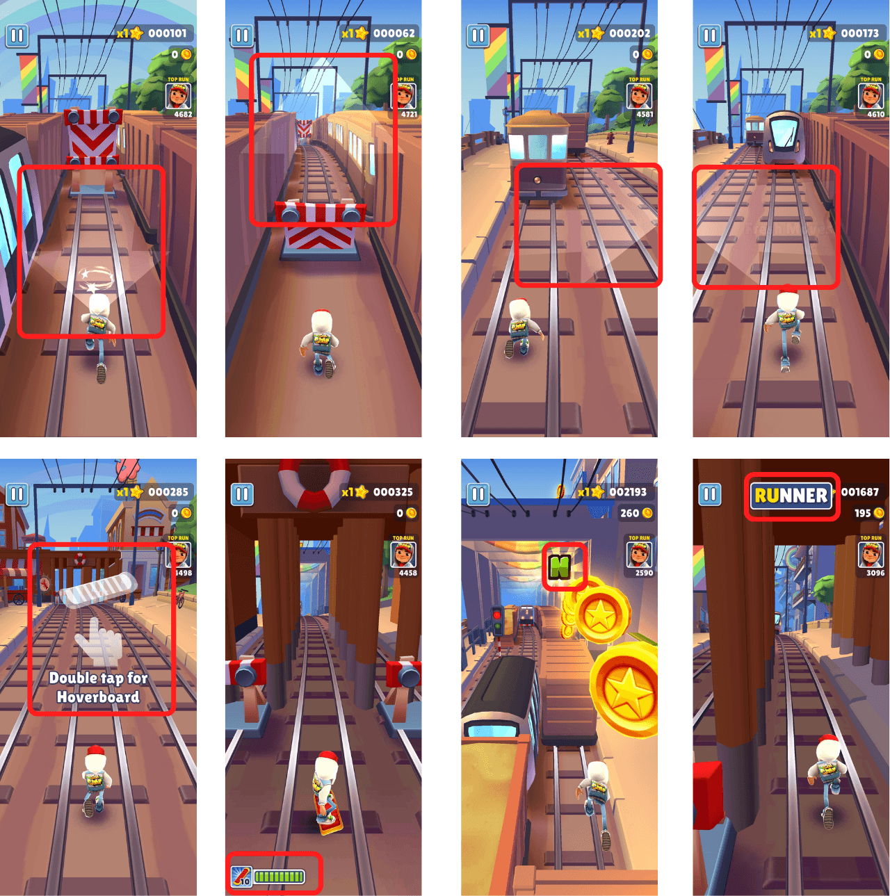
A bit on Subway Surfers
Subway Surfers is an endless runner mobile game co-developed by Kiloo and SYBO Games.
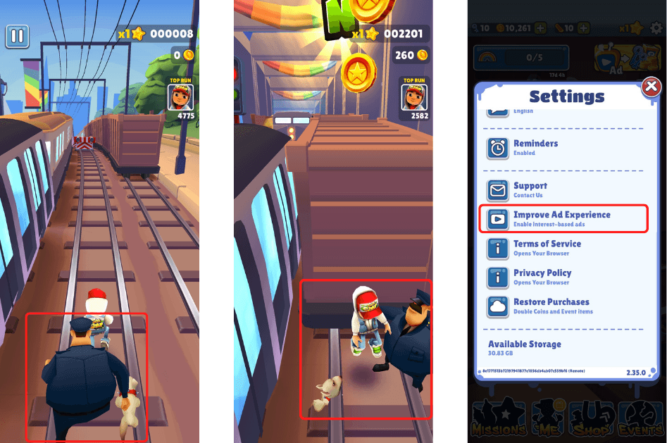
In the game, players take the role of young graffiti artists who, upon being caught in the act of "tagging" a metro railway site, run through the railroad tracks to escape from the inspector and his dog.
As they run, they grab gold coins, power-ups, and other items along the way while simultaneously dodging collisions with trains and other objects.
They can also jump on top of the trains and surf with hoverboards to evade capture until the character crashes into an obstacle, gets caught by the inspector, or gets hit by a train, at which point the game becomes over.
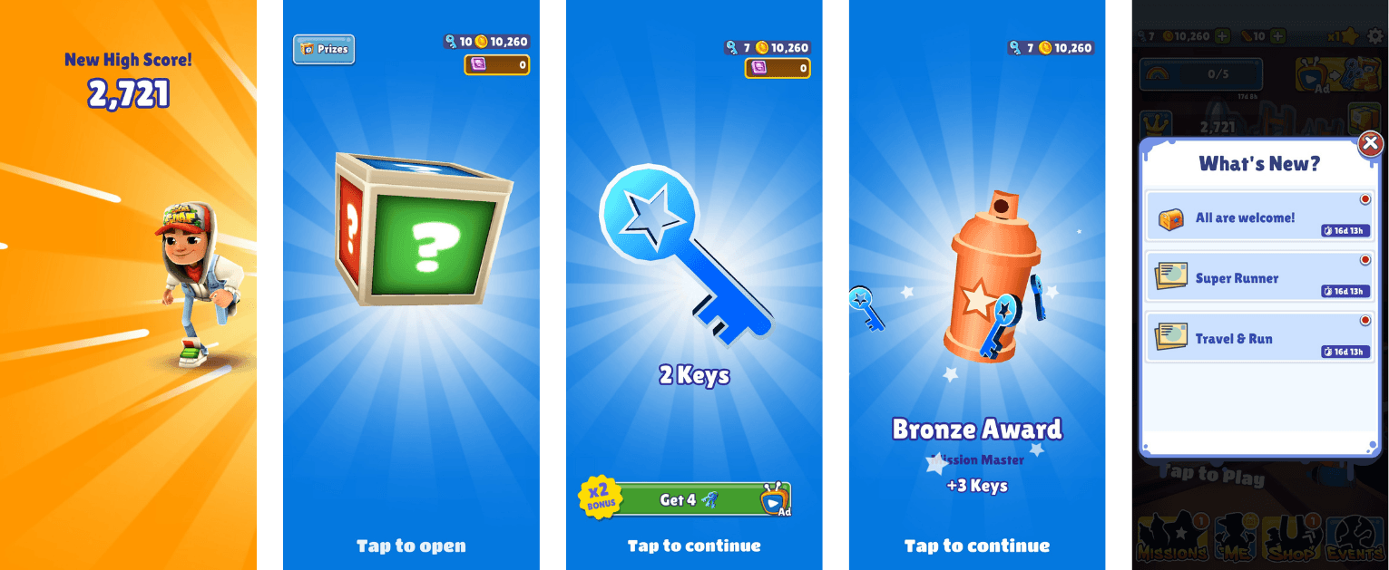
Special events, such as the Season Hunt, can result in in-game rewards and characters.

Visibility of system status
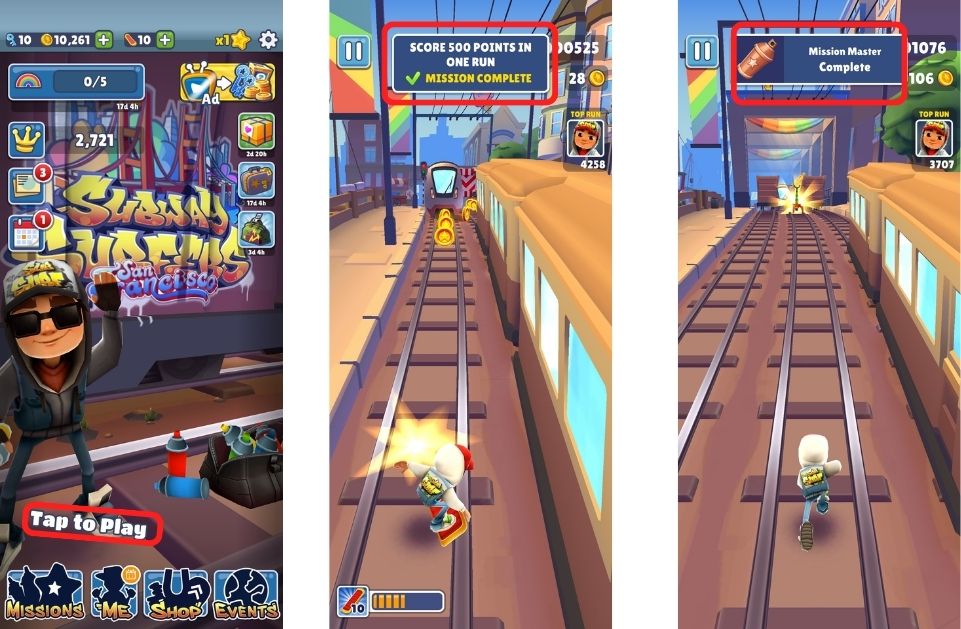
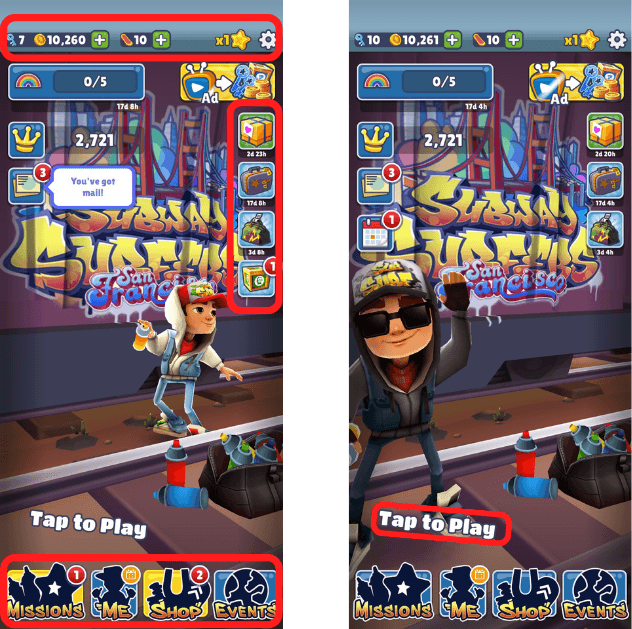
Maintaining visibility of the system status is crucial in keeping users informed about their progress and the overall state of the game. Upon entering the landing page, users are immediately prompted to engage with the game through a simple tap on the screen, signaling that the adventure has begun. As players navigate through various levels, they receive timely notifications regarding mission completions, which not only enhances their gaming experience but also reinforces their sense of accomplishment. By ensuring users are aware of their current status within the game, the design fosters a seamless interaction that enhances user satisfaction.
Match Between System and the Real World
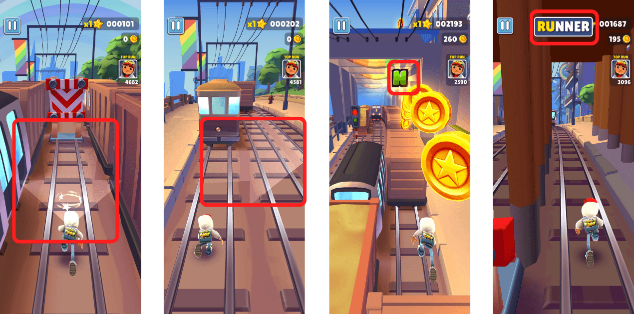
A well-designed interface should communicate in a language that users easily understand. In this game, the onboarding experience employs simple visual cues, such as arrows, to guide players on how to navigate and utilize unique features like the skateboard and jumper shoes. The terminology used throughout the missions is intentionally straightforward, focusing on actions like “collecting letters” to form words. This not only makes the gameplay accessible to a wider audience but also encourages users to engage with the game more intuitively, as they can relate the gameplay to familiar real-world concepts.
User Control and Freedom
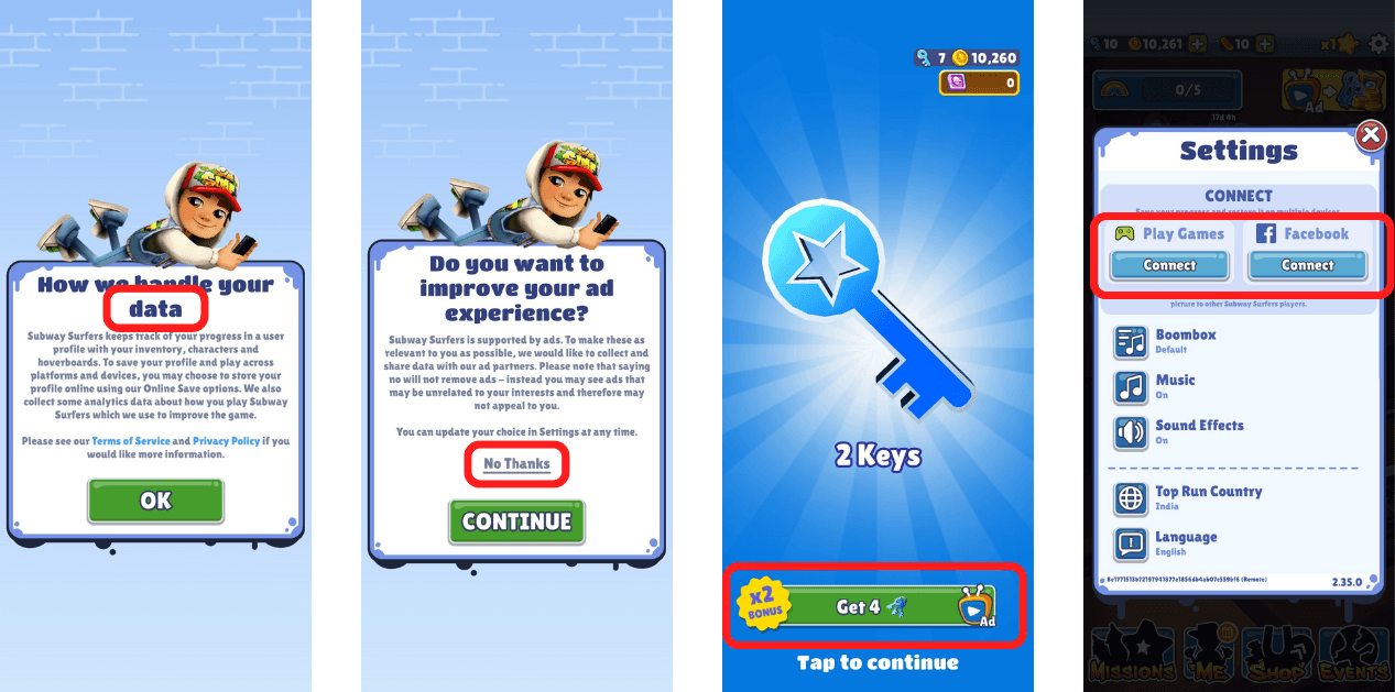
Empowering users with control and freedom enhances their overall experience and reduces frustration. From the onset, players are given the option to opt out of data collection during installation with a simple “No Thanks” button, allowing them to make informed choices about their privacy. Once gameplay begins, players can choose to double their rewards by watching advertisements, but they also have the autonomy to skip this option if they prefer. This flexibility extends to the connection with social media platforms, where players are not forced to link their accounts but are informed of the benefits if they choose to do so. This user-centric approach fosters a sense of trust and control, enabling players to enjoy the game without feeling pressured.
Consistency and Standards
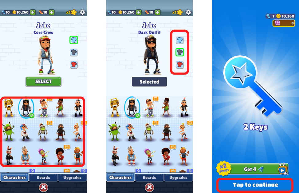
Consistency across the interface is vital for creating a coherent and predictable user experience. In this game, players have the freedom to select from multiple avatars without impacting the underlying gameplay or story progression. This design choice maintains a uniform experience, ensuring that users do not feel disoriented by varying character interactions. Moreover, key actions, such as starting the game or claiming rewards, are consistently communicated through clear prompts positioned at the bottom of the screen. This adherence to established conventions helps users navigate the game intuitively, reducing the cognitive load associated with learning new interfaces.
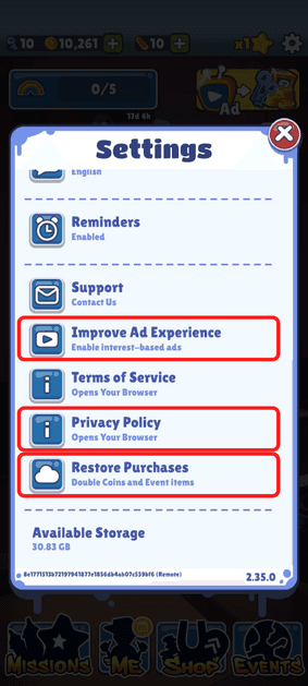
Error Prevention
Proactive error prevention is an essential aspect of user-friendly design. Instead of merely providing error messages after a mistake has been made, this game incorporates features that allow players to cancel unintended actions, such as accidentally clicking on an advertisement. This immediate feedback loop ensures that players can smoothly transition back to the game without disruption. Additionally, users who opt to share their data during installation can easily revert this decision through the settings menu, reinforcing the idea that they have ongoing control over their preferences. The design also facilitates the easy restoration of in-app purchases, further preventing user frustration and enhancing the overall experience.
Recognition Rather Than Recall
Minimizing memory load is key to improving usability. In this game, once players become familiar with its mechanics, they can easily recognize and utilize various in-game features that mirror real-world objects. For instance, the magnet feature allows players to attract coins, while jump shoes enable them to leap over obstacles like trains and buildings. These intuitive designs not only enhance engagement but also provide a sense of familiarity that makes gameplay more enjoyable. Additionally, the landing page consolidates essential information, including gameplay history and collected rewards, allowing players to easily recall their progress and achievements without straining their memory.
Flexibility and Efficiency of Use
A well-designed interface should cater to users of varying skill levels. The game’s main user interface prominently displays a “Tap To Play” button, making it easy for all players to initiate gameplay. Meanwhile, additional features—such as settings, missions, avatar selection, and rewards—are conveniently located on the landing page, providing quick access to essential tools. This thoughtful organization allows novice players to navigate the game with ease while also enabling experienced users to streamline their interactions. By accommodating the needs of both groups, the design promotes efficiency and satisfaction.
Aesthetic and Minimalist Design
Clarity and simplicity are hallmarks of effective design. In this game, the interface is purposefully designed to avoid unnecessary clutter, presenting only relevant information to the user. For example, when players are caught by the police, they are presented with their current score and worldwide ranking in a clear and visually appealing manner. Similarly, the reward and unboxing sections follow a minimalist aesthetic, allowing players to focus on their achievements without distraction. By prioritizing essential information and minimizing extraneous details, the design creates an inviting environment that enhances user engagement.
Help Users Recognize, Diagnose, and Recover from Errors
Clarity and simplicity are hallmarks of effective design. In this game, the interface is purposefully designed to avoid unnecessary clutter, presenting only relevant information to the user. For example, when players are caught by the police, they are presented with their current score and worldwide ranking in a clear and visually apWhen errors occur, clear communication is key. This game adopts a user-friendly approach to error messages, expressing issues in plain language rather than relying on confusing error codes. For instance, if a player collides with an obstacle, they are quickly informed of the consequence—an approaching police chase—encouraging them to adjust their actions to avoid game over. Additionally, if users encounter irrelevant ads based on their search history, they can easily disable these advertisements through the game settings. This emphasis on clarity not only helps users understand what went wrong but also guides them toward corrective actions.pealing manner. Similarly, the reward and unboxing sections follow a minimalist aesthetic, allowing players to focus on their achievements without distraction. By prioritizing essential information and minimizing extraneous details, the design creates an inviting environment that enhances user engagement.
Help and Documentation
Providing comprehensive guidance enhances the user experience by making the game accessible to everyone. As users embark on their journey, they are systematically guided through the gameplay mechanics, with clear instructions on completing missions, collecting rewards, participating in ongoing events, and upgrading their avatars. This support structure ensures that players feel confident and informed as they navigate the game, making it less intimidating and more enjoyable. By laying out concrete steps, the design not only aids in user onboarding but also encourages continued engagement with the game’s features.

Thank you!!!
If you have any feedback,feel free to share it with me.
Your insights are valuable and will contribute to
my continuous improvement.