
Role
Product Designer + Developer
Team
Vaibhav Doifode - UX (Myself)
Duration
1 Week
Assumptions set before starting
with research and designing interface
Time Period:
Year 5-10
Early establishment phase.
Settlement Type:
Scientific research & Resource extraction (water ice, minerals)
Charging Infrastructure:
Solar Stations + Supercharg Stations
This Means for the Rover:
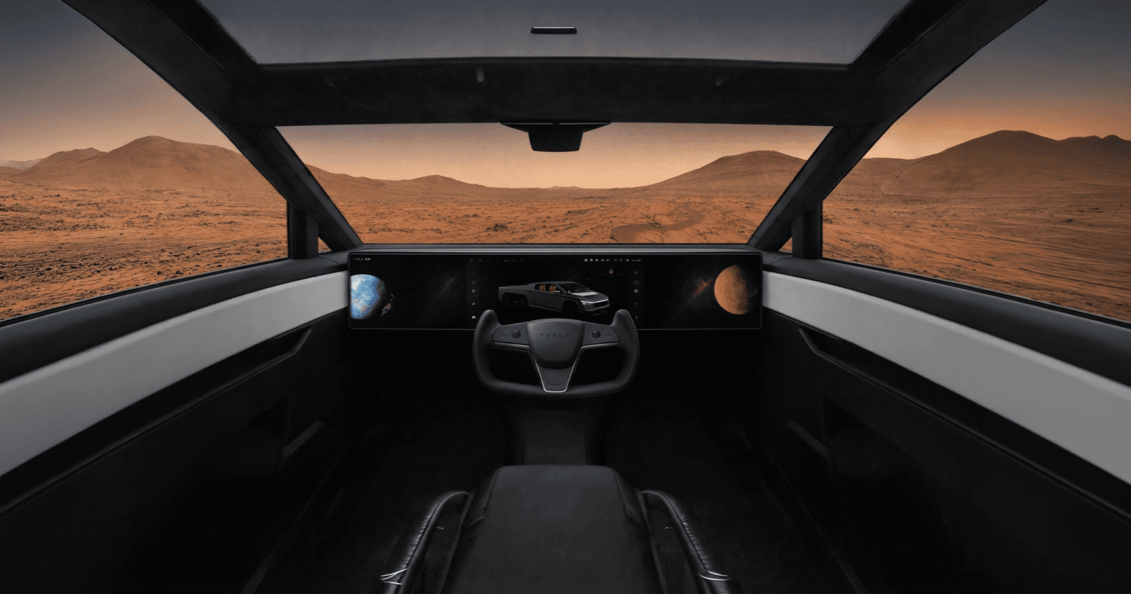
Rugged Built for function & Survival-first design
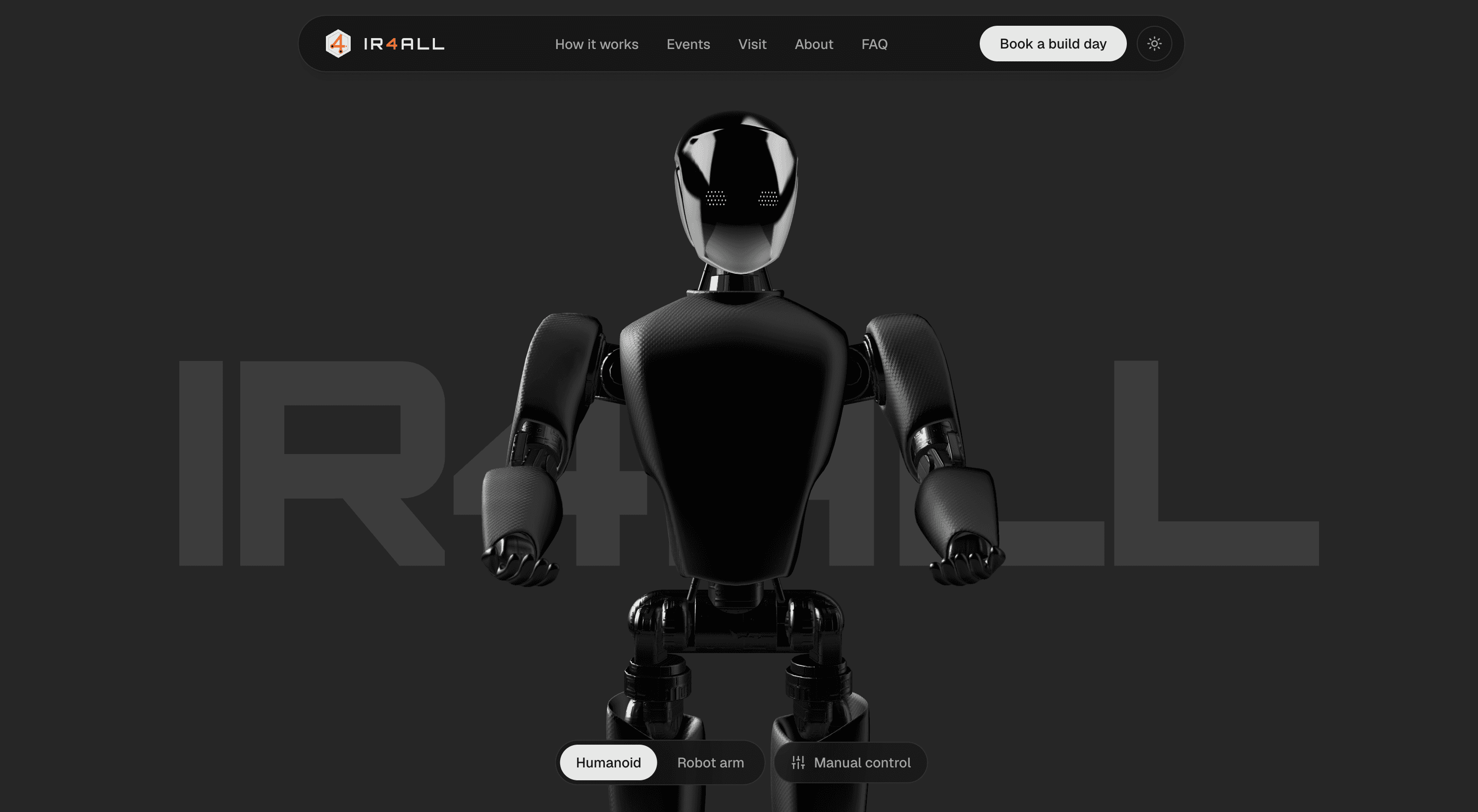
The hero buys attention. The rest of the page has to convert it, and three sections do specific persuasion jobs.

The price card: making "free" land
Telling a teenager something is free does not work. So the page makes them watch the price disappear.

The Earth Fly-in: To drive physical visits to Mesa, a plain address isn't enough. Instead, the Visit section features a Google Earth fly-in from orbit directly to the ASU MIX Center, ending with a pin drop and actionable Maps and Directions links.
Reflection
I used Claude Code as an implementation partner, the same way I would use any tool that types faster than I do. What it does not do is decide that cursor tracking breaks on the primary device, or that the fix is capability detection rather than breakpoints, or that motion should scale instead of the model. Those are the decisions in this project and they are mine. Ask me about any file and I will walk you through why it is shaped that way.
Why a live 3D scene instead of a video? A video is cheaper and looks the same.
A video looks the same for two seconds and then stops being the product. Phase 1 of this program is literally a browser based arm simulator with joint control. The hero is a preview of the thing the student is being recruited into, not a metaphor for it. The moment the arm turns to follow your cursor, the page has made a promise it can keep. A video makes a promise it cannot.
I cannot fully defend it, which is why it is in the case study. The bet was that demonstrating the product beats describing it, and for a skeptical sixteen year old I still think that is right. What I got wrong is shipping it without a static first paint, so the page cannot show a call to action until the 3D runtime loads. That is the first thing I would fix, and I would set a hard time to interactive budget measured on a real mid tier Android rather than a throttled desktop.
Results from 12 moderated sessions showed strong qualitative success: users unprompted stated they wanted to join, proving the design actively recruits. Final conversion numbers for MIX Center enrollments are still pending while the live program runs.